This New Video Map of Space Will Make You Feel Utterly Insignificant
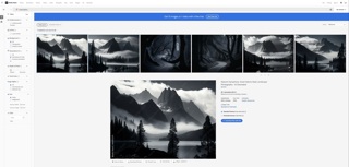
Top image: A map showing all galaxies in the nearby universe. Each galaxy is color-coded to signify distance, with blue representing the closest and red signifying the most distant — up to 300 million light-years away. Credit: University of Hawaii.
It’s called the Cosmic Flows project and it’s an effort to map both visible and dark matter densities around our galaxy up to a distance of 300 million light-years. The map, which is presented in video format, shows our immediate intergalactic neighborhood through a series of dynamic 3D representations that are rotated, panned, and zoomed. It’s the most detailed map ever created of our local vicinity, and it does a remarkable job showing us what our neighbourhood looks like.
Related
Neil deGrasse Tyson shares the most astounding fact about the universe
Back in 2008, TIME Magazine sat down with Neil deGrasse Tyson to ask him ten reader-submitted questions about science and the cosmos. Eventually,… Read…
It’s important to remember that this cosmography of the local universe represents a miniscule fraction of the whole thing - about 0.32%. The observable universe is over 93 billion light-years in diameter (that’s the visible universe; this is an unknown, likely infinitesimal, fraction of “the whole thing”). So as humbling as this is, the bigger picture is more daunting, still. (Then again, perhaps you’re the kind of person who finds the Universe inspiring. Which, how can we blame you, really?)
The video is over 17 minutes long, but don’t let that put you off. Things pick up quickly after the 1:15 mark.
More: This New Video Map of Space Will Make You Feel Utterly Insignificant